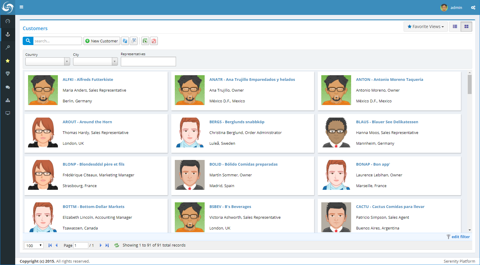
# Card View & React
Card view allows you to show records as fully customizable cards, and easily switch between Card / List views.
thanks a lot to Brainweber Inc. for sponsoring this feature and letting us share it with community

This feature is implemented as a Mixin that you can simply apply to any of your grids (EntityGrid / DataGrid).
CustomerGrid.ts:
    var editItem = this.editItem.bind(this);

    new Serenity.CardViewMixin({
        grid: this,
        renderItem: (item, index) => React.createElement(CustomerCard, {
            item: item,
            editItem: editItem
        })
    });
We used React for card templates, so you can simply customize it to your needs and use any property available in your rows.

CustomerCard.tsx:
    export class CustomerCard extends React.Component<CustomerCardProps> {
        render(): React.ReactNode {
            var item = this.props.item;
            return (
                <table>
                    <tbody>
                        <tr>
                            <td rowSpan={4} className="img">
                                <img src={getRandomImage(item)} />
                            </td>
                        </tr>
                        <tr>
                            <td className="name">
                                <a href="javascript:;" onClick={e =>
                                this.props.editItem(item)}>
                                    {item.CustomerID} - {item.CompanyName}
                                </a>
                            </td>
                        </tr>
                        <tr>
                            <td className="contact">{item.ContactName},
                            {item.ContactTitle}</td>
                        </tr>
                        <tr>
                            <td className="country">{item.City}, {item.Country}</td>
                        </tr>
                    </tbody>
                </table>
            );
        }
    }
}